

Attracting people’s attention on the Internet is a difficult goal to achieve these days. Being flashy, interesting or shocking is the way to get noticed, even in business. To stand out from the rest is not always about being better at your job than others, but to be creative in the way you present the facts to the viewers or possible clients. That creativity can also be expressed in the way you design your infographics.
Infographics can be seen on various devices – tablets, phones and computer desktops. It is a smart move to use their power of reaching people. They represent a marketing strategy for your business, so make sure your infographics are noticeable in the sea of others. Here are several things to bear in mind.
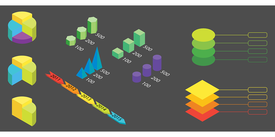
1. Simplicity of the layout
Don’t be attracted to all the options that infographics offer and use them just because they are available. Overcrowded infographics with unnecessary pictures and icons are hard to understand and lose their meaning. Stick to a simple layout with the most important information put in a couple of lines. For the rest of the information, you should use pictograms or charts to convey your message or facts. You should watch out for them, too, don’t overdo the use of them, either. The same advice refers to the typography or any other part of the infographic.
- Also check: Simplifying Mobile App Development
2. Eye-catching title
Most of the people choose what they would read according to the title they see. The more the title is attractive, the more are the chances the text or, in your case, the infographic will be looked at. The art of catching somebody’s attention with a few words that represent the core idea of your infographic is not an easy skill. In most cases, people react positively to titles such as “How to”. If it doesn’t come naturally to you, you can seek the help from title generation tools. If you feel you are not up for the job, consider hiring a copywriter for this task.
3. Informative content
Whatever facts you choose to present in your infographic, it is crucial that they are accurate. You do not want to lose your integrity in the eyes of the viewers by providing false information. If you don’t want to do research on your own, you can visit public datasets that can provide solid facts. In any case, just be sure the facts you are sharing with others are really that – facts.
Another characteristic of good quality content is its attractiveness. Think about this: How interesting or intriguing will your facts be to the viewers? Can this content draw attention of the viewer? People have short attention span, so be sure that your infographic makes them want to stick around.
4. Choice of colors
Again, using everything that is offered is not advisable. Rather than using random colors just for the sake of the infographic looking lively, put colors similar to your logo, in various shades. An expert logo designer will always stress the connection between the logo and the colors used for the website design or web graphics. Another possibility is to use only the complementary colors, which will look nice and moderate. There are helpful tools for choosing the right colors, for example, Paletton, in case you need additional ideas.
5. Interactivity
To prevent your infographic from becoming dull and ordinary, you could also consider using an animation tool, which would allow the infographic to move. This interesting option enables the interaction between the viewer and the infographic, thus making the infographic more compelling. You can take it to a higher level by adding, for example, click-and-touch scrubbers, which are easiest to make with tutorials. In short, with the help of interactive graphics and its effects, you can really make is stand out from the crowd.
6. Appealing tools
Infographic tools are there to assist you to make your infographic as original as possible. Some of them are free, while for some of them you need to pay. Whichever you choose, their purpose is to help non-designers, namely amateurs, to create unique infographics. For that reason, their use is pretty simple – you only have to drag and drop icons that you like and you get an original infographic design. The same method refers to fonts, too. Just make sure you don’t get carried away because of the amount of choice – stick to the maximum of two types of fonts, to keep it simple.
7. Meaningful organization
All of the tools, colors, images and text that your infographic comprises of mustn’t make a mess. For the infographic to have a real meaning and clear goal, it is necessary to organize it as a simple story. People like stories, so make a use of that. Add a bit of light humor to motivate the viewers to share or like your infographic. In other terms, put all of the elements that you have chosen in a simple and elegant frame.
Conclusion
You shouldn’t rush when creating an infographic. Take each of these tips into consideration and also do your own research. If you do this job properly, your infographics will do the same for you and your business.
John Stone is a business consultant at SEO Sydney. Through years of experience, he became a devout believer in the notion that form should always follow function and that developing the ability to think outside of the box is a prerequisite of being a successful entrepreneur.


Comment here